Background.
Fellowship congregational church was very open to branching out with their logo, especially in the interest of standing out as a progressive and active community. They expressed interest in a logo alluding to their building, along with other less overt ties to the ministry. In the above link, their logo is currently drawn from a presentation deck and has not been updated to the packaged files sent at the project's close. Ideally, this will be refurbished soon.
.png)
Chosen logo before color alteration

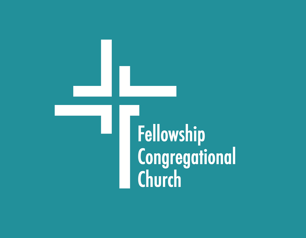
Final Logo Iteration
The Chosen Logo.
This, the selected design, represented members of all different walks of life coming together in unity, because without unity, support, social justice, and inclusivity the church is not whole. In the negative space of the logo, a cross is formed. It is important to note that the logo's colors were changed to accommodate the website (which was being designed during my creative process).
Process.
Having provided them with a variety of options that each offered a different look and feel, I built metaphors for the ministry into most if not all. The cross made up of pathways reveals the power of individuals taking different paths, but coming together in worship. The logo option with a serif font was created in homage to their previous logo, which featured similar abstract figures. The design of the facade is represented in a contemporary light. This youthful design reflects its current and progress-minded ideals.