


Background.
This company's name, Double Flag, was inspired by the dual hurricane flags. For their logo, the clients were looking for something that tied into the identity of TU through a symbol often affiliated with the university mascot. They expressed the desire that have a clean and modern look.
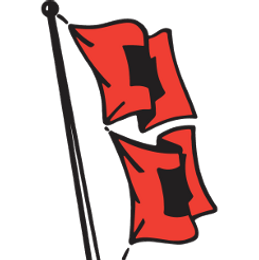
Hurricane Flag
Inspiration.
The first option was a paired down version of the original hurricane flag. It has been altered to appear less vertical and more balanced visually, with an arc formed by both flags and coffee bean. Comprised of several variations, the second is also modern; however, it has more weight to it with a blocky feel.
Process.
Originally, the second option was simpler. It featured sharp corners and didn't make the connection between the two flags and the "D" motif. That update really strengthened the cohesiveness of Double Flag's brand identity.